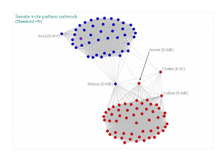
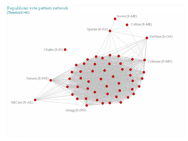
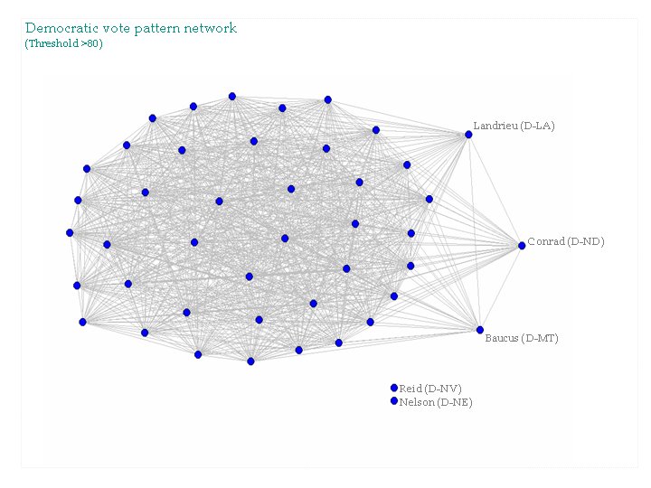
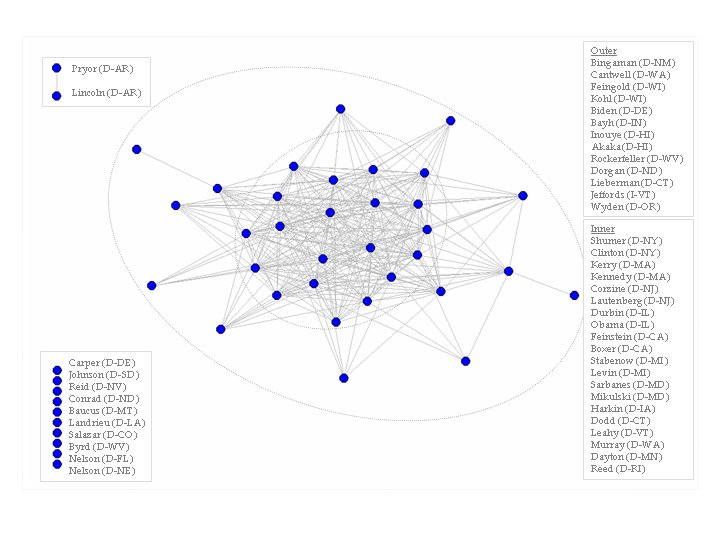
A Tale of Two Dubyas

Recently, after listening to our current President speak I decided to compare presidential speeches. I first started to look at text based networking methods to compare theme and usage biases, but then I read about readability scores. Although speeches are not meant to be read by anyone other than the speaker, I decided that a readability analysis should also work for speeches. There are many ways to test the readability of a text. Most of the readability tests express the result as a grade level that the reader should have finished to understand the given text. I used five different tests of readability, the Gunning fog index, the Coleman Liau index, the Flesch Kincaid Grade level, the Automated readability index and the SMOG. All of these indices are very similar and gave similar results.
The above graph shows results of all five averaged for each president. After I analyzed the State of the Union speeches for the presidents, I was curious to compare a formal speech with a less formal speech. I chose the election debates as a less formal speech. My thinking was that the State of the Union address is written by a team of professional writers while a debate is not. This is not to say that a president is not prepared by his staff before a debate. Of course he is. But, during a debate a president will have to answer on his own occasionally. My assumption was that the grade level will be higher for the more formal State of the Union address. In all cases this was true. If we use the difference between the two types of speech for each president as a measure of how much help the president receives for formal speeches we can get to my next assumption. I assumed that George W. Bush would score the highest, as needing the most help. This seems to be the case. Bush's speech level moves up 3.3 grade levels when he goes from a less formal speech to a formal speech. And, GWB and his father are the only presidents who have a debate grade level at the middle school level.
Note: Between the Kennedy-Nixon debates and the Carter-Ford debates there were no election debates held. This is why I did not include LBJ in the analysis. I obtained the text from all of the speeches and debates from The American Presidency Project. Also, I used an online text analyzer to obtain the readability scores.
posted by peoplewatcher at 9:55 PM
1 comments
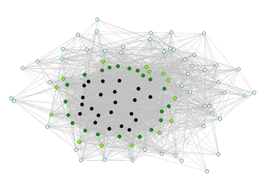
![]()
![]()